Ferrari Luce Design Divides Opinion as Frank Stephenson Weighs In
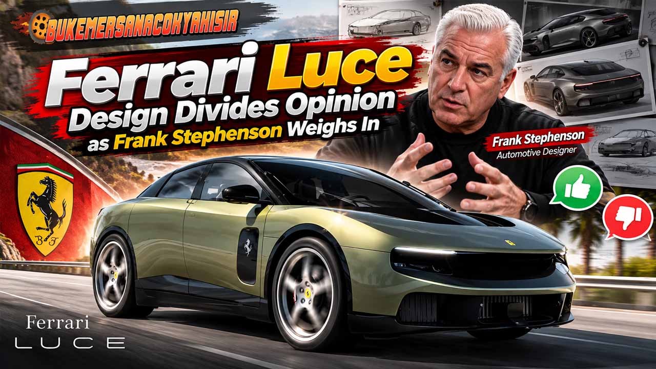
Bukemersanacokyakisir – A new Ferrari usually invites a long look. With the Luce, however, designer Frank Stephenson finds himself questioning what that look reveals. His Ferrari Luce design review centres on a sharp distinction: careful execution does not automatically create a compelling car. After allowing his initial reaction to settle, the McLaren P1 designer still considers its appearance generic and emotionally distant. Nevertheless, his assessment includes praise for selected details, particularly inside the cabin. That contrast makes his argument worth examining. Rather than dismissing electric propulsion, Stephenson questions whether the finished design communicates Ferrari’s character strongly enough. For him, the central issue concerns recognition, personality, and the emotional connection behind the badge.
Polished Execution Does Not Guarantee Emotional Appeal
Stephenson’s criticism separates craftsmanship from creative direction. A design can feature precise detailing and carefully resolved surfaces while still leaving an observer unmoved. In his view, that tension defines the Luce. Moreover, he rejects the suggestion that another manufacturer’s badge would make its appearance more acceptable. His dissatisfaction extends beyond expectations attached to Ferrari. From a broader design perspective, this raises an interesting question: when does visual restraint become anonymity? Clean surfaces can communicate confidence, but they also need proportion and character to remain memorable. Consequently, his argument concerns the overall impression rather than an isolated component. The individual elements may appear deliberate, yet he believes their combination lacks emotional impact.
One Flowing Surface Earns Genuine Praise
Despite his dissatisfaction, Stephenson identifies an exterior detail that deserves credit. He highlights the continuous surface extending from the upper front bumper, beneath the bonnet’s aerodynamic wing, and towards the windscreen. According to his assessment, this treatment makes thoughtful use of the freedom created by removing a conventional petrol engine. Instead of simply reproducing familiar combustion-car proportions, the design explores a different relationship between its surfaces. Importantly, this observation gives his criticism some balance. He recognises an idea with architectural merit, even while questioning the wider result. It also illustrates a challenge facing electric performance cars: new engineering opportunities must support a coherent visual identity across the entire vehicle.
The Front End Lacks a Distinctive Face for Stephenson
Moving to the front, Stephenson sees too little individuality. He considers the broad surfaces insufficiently expressive and struggles to identify a memorable visual signature. However, this remains an aesthetic judgment rather than evidence of poor engineering or aerodynamic performance. A restrained front end can appeal to buyers who prefer understatement. The difficulty, in his argument, lies in making that restraint feel unmistakably Ferrari. Traditionally recognisable design does not require copying an older model, but it benefits from a clear relationship between shape and character. Therefore, the debate extends beyond whether the nose looks attractive. It asks whether someone could recognise the manufacturer before noticing the emblem.
Also Read : LeBron James Leads 76ers Past Knicks in Season Opener
Side Details Disrupt the Visual Balance
Along the sides, Stephenson focuses on the dark, squared treatment on the front door. He considers it visually disconnected from the surrounding bodywork. Meanwhile, the shoulder line receives criticism for lacking tension and direction. Black graphics around the wheel openings also trouble him because they appear to increase the visual distance between the body and tyres. This is a useful distinction: a styling treatment can change perceived proportions without changing actual ride height. In his reading, those accents suggest an off-road character that conflicts with the image he expects from Ferrari. Together, these details explain why his concerns involve visual relationships, rather than simply a preference for sharper lines.
Four Round Tail-Lights Cannot Carry the Rear Alone
The rear attracts some of Stephenson’s strongest objections. He describes its composition as confusing, with overlapping forms that struggle to establish a convincing hierarchy. Although four circular tail-lights provide a recognisable Ferrari reference, he considers that gesture insufficient. His broader point is that heritage cannot depend on one familiar feature. Instead, the lights, body surfaces, and surrounding graphics need to reinforce one another. This interpretation offers a useful way to assess automotive styling: recognition comes from the complete composition. Nevertheless, another viewer might appreciate the same rear for departing from established conventions. Stephenson’s verdict remains a clear expression of his design priorities, rather than a universal measure of beauty.
The Interior Receives a More Generous Assessment
Inside, his tone becomes noticeably warmer. Stephenson praises the layout, features, detailing, and quality of execution. He also acknowledges the practical appeal of a cabin arranged around four doors and five seats. However, admiration for the interior does not resolve his concern about identity. He questions whether the environment would immediately suggest Ferrari without its branding. That distinction matters because comfort and character can serve different expectations. A thoughtfully organised cabin may work beautifully as a product while leaving an enthusiast wanting a stronger connection to the marque. In this part of his assessment, the Luce earns respect for its execution, even as its emotional message remains open to debate.
Ferrari’s Future Involves More Than a Familiar Badge
Ultimately, Stephenson wants innovation to preserve a recognisable Ferrari personality. His preferred balance combines advanced thinking with the emotional and analogue qualities he associates with the brand. Yet moving into a new design era inevitably creates disagreement about which characteristics should survive. The most interesting question is whether the Luce establishes a convincing new identity or weakens an existing one. Stephenson clearly favours the latter interpretation, although his opinion cannot predict buyer demand or long-term cultural significance. Time may soften reactions or reinforce them. For now, his critique highlights a demanding task for Ferrari: making a radically different vehicle feel distinctive, coherent, and emotionally persuasive from every angle.


Post Comment